link to my portal page for the PDF process book.
http://www.leonardo20.aisites.com/
Tuesday, June 14, 2011
Tuesday, June 7, 2011

Monday, June 6, 2011
Wednesday, June 1, 2011


Wednesday, May 25, 2011

Tuesday, May 24, 2011


Thursday, May 19, 2011
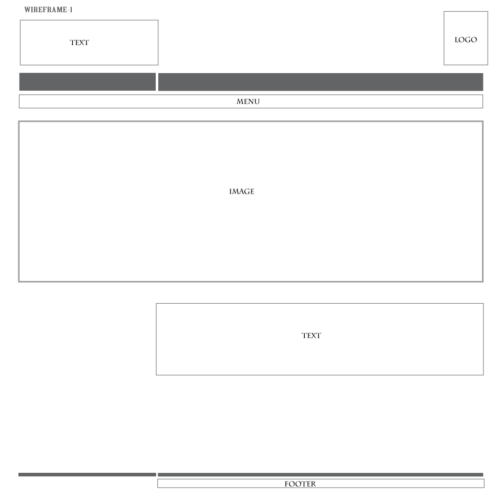
Glacier Bay Creative Brief
The purpose of the website to inform visitors of the different scenic activities at Glacier Bay.
Content:
Park Home: Introduction of Glacier Bay with a scenic view of the park.
Photos: photos taken at the park
History and Culture: Description of history and culture at the park.
Nature and Science: Plants and animals at the park.
Audience: adventures
Perception/Tone: outgoing
Content:
Park Home: Introduction of Glacier Bay with a scenic view of the park.
Photos: photos taken at the park
History and Culture: Description of history and culture at the park.
Nature and Science: Plants and animals at the park.
Audience: adventures
Perception/Tone: outgoing
Tuesday, May 17, 2011
Thursday, May 12, 2011

Tuesday, May 10, 2011


Friday, May 6, 2011
Glacier Bay Artist Statement
The design of the websites is to be scenic, adventurous, and outdoor activities for tourist. The process of the design was centered around photo images of the park.
For the scenic layout, I wanted to pick an image with a very scenic image at Glacier Park. I wanted to design the image to make you feel elegant and a very peaceful scenic park. The object of the site is to have you feel relaxed and peaceful at Glacier Park.
For the adventurous layout, I wanted to pick an image with the glaciers. I wanted to design the image to feel like you are at Glacier Park discovering and exploring. The object of the site to have an adventurous feel at Glacier Park.
For the outdoor activities, I wanted to pick an image with some sort of outdoor activity at Glacier Park. I picked an image with a person kayaking at a river, with the mountain at the background. I wanted to design a theme, so that the tourist know that you can do many outdoor activities at Glacier Park, like kayaking.
I think what works with my design is incorporating photo images of Glacier Park with colors similar in the photos. By choosing similar colors in the images, it made it successful with the overall design process.
Thursday, May 5, 2011


Tuesday, May 3, 2011


Thursday, April 28, 2011


Wednesday, April 27, 2011

Tuesday, April 26, 2011
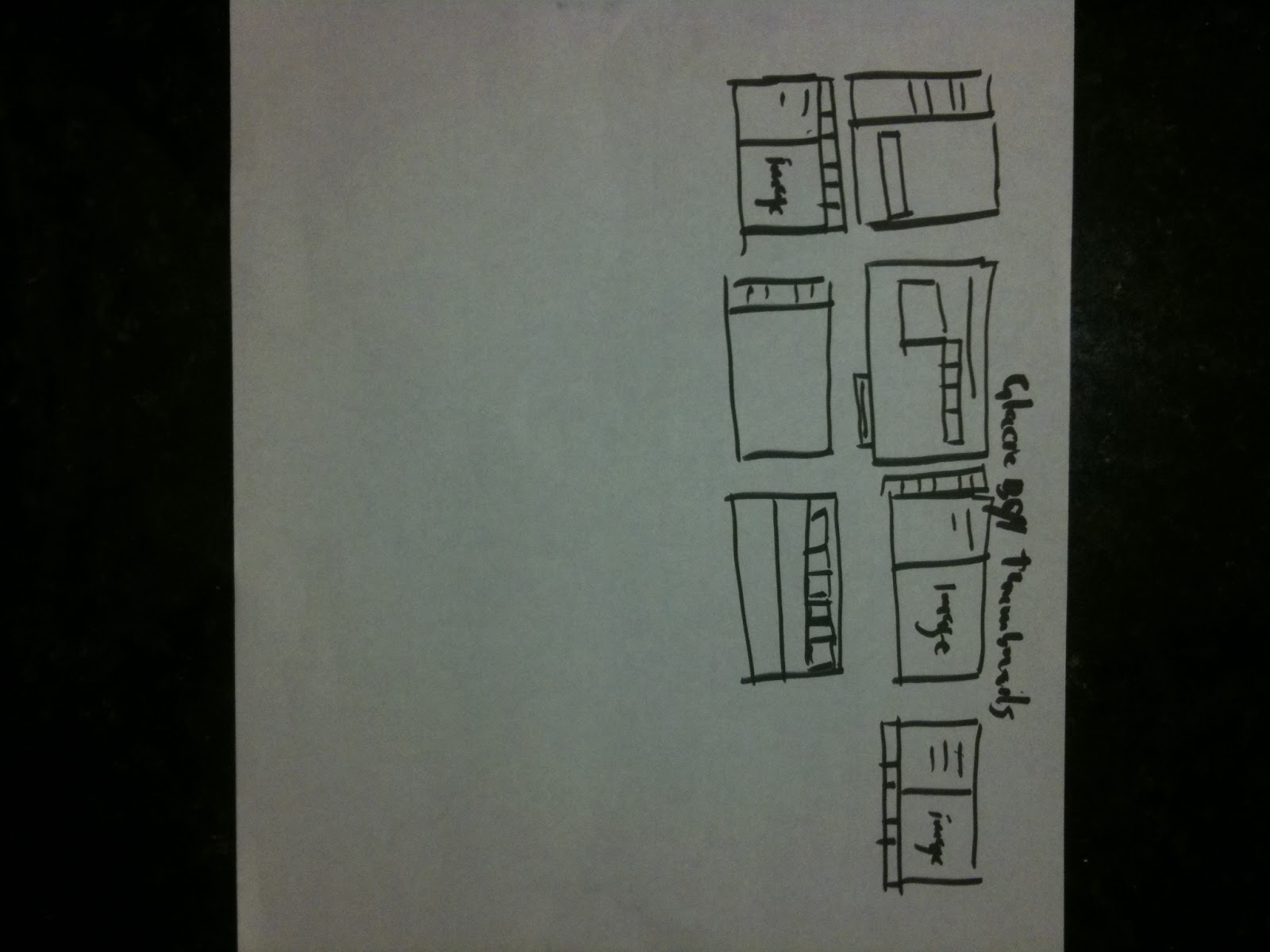
Layouts Creative brief:
Glacier Bay:
The design of the websites is to be adventures, scenic, and tourist information site. The design process is centered with photo images of the park. The primary users will be adventurers, activities, and informative tourist site.
The design of the websites is to be adventures, scenic, and tourist information site. The design process is centered with photo images of the park. The primary users will be adventurers, activities, and informative tourist site.
Andy Warhol Artist Statement


Wednesday, April 20, 2011
Tuesday, April 19, 2011


Saturday, April 16, 2011
Thursday, April 14, 2011


Wednesday, April 13, 2011
Tuesday, April 12, 2011

IMD 105 Andy Warhol Proposal

I’m going to design the banner by representing his style of bright; vibrant colors and designing it like a grid system, similar to Warhol’s repetitive style on some of his artworks. Images I’m going to use: Campbell's Soup Cans ,Coca-Cola bottles, Elvis, Marilyn, Micky Mouse, Flowers, Jackie, Red Race Riot, Goethe, etc.
Image size: 980 pixel by 400 pixel
Sunday, April 10, 2011
Friday, April 8, 2011
What are your 3 favorite websites?

I like this website because of the content. White is the main background color for all the pages. The larger images have the newest articles. The main titles are in a larger font and in bold type. The header is at the top of all the pages, with the Washington Post logo on the left. The design is very simple. Overall the color scheme is white and black. It's designed to be like a newspaper. The grid structure is 1/3 navigation and 2/3 content. From a design standpoint, it's very busy with advertisements, but fairly good as a news media site.

I like this website because of the variety of videos to view, and it is a unique learning tool. White is the main background color for all the pages. The images are snap shots of the the videos to be viewed. The font type is all the same and very small. There is no header design, just the YouTube logo with the search site. Overall the color scheme is black, white and blue text. The site is made only to view uploaded videos. As a designer, the site is very boring. There is no design thought to the site.

I like the this website because of the sports news. The background colors change for each site and with each different sports theme. The typography is all in the same font and very easy to read. The header design changes on each page with the different sports themes. Overall color scheme is very colorful and intriguing for each site. The website is targeting sports fanatics who are looking for up-to-date scores and news. The site is designed into zones with the highest priority and most graphics at the top. There are videos at the top of each site and placed to be viewed first, which compliments the article. As a designer, the site is very well designed.
Subscribe to:
Posts (Atom)